Character illustration is not decoration for decoration’s sake. When it is chosen with discipline, it gives a website a face, a tone, and a cleaner line between a memorable brand and another anonymous template.
In web design, a character illustration is a drawn person, mascot, creature, or stylized figure used to support navigation, explain a service, reinforce brand identity, or carry a story across a page. Earlier websites often treated characters as novelty. Stronger modern work treats them as part of the visual system: one more layer that helps the site feel coherent, distinct, and easier to remember.
The increase in custom illustration across boutique brands, product sites, and personality-led service pages is not hard to explain. Stock photography can fill space, but it rarely gives a business a signature. A well-designed character can do that job quickly, provided it still respects the structure of the page and the needs of the reader.
What Character Illustration Adds to Web Design
Character illustration matters because it works on several levels at once. It can pull attention toward key content, make a brand easier to recognize, and give abstract ideas a human shape. That combination is useful on landing pages, About sections, onboarding screens, service explainers, and blog headers where tone matters as much as information.
There are three practical advantages worth keeping in view:
- Engagement: a distinctive character gives the eye a natural focal point and can help break up long runs of text.
- Brand recall: when a character appears consistently across pages, it becomes part of the brand memory, not just a one-off accent.
- Storytelling: characters can demonstrate mood, audience, and product context faster than paragraphs usually can.
That last point is where many teams either gain clarity or wander into clutter. If the character is there only because the layout felt empty, it will probably behave like filler. If it is there to guide a section, signal the intended audience, or reinforce a specific brand voice, it usually earns its space.
Why Illustrated Characters Improve the Reader Experience
Readers do not separate aesthetics and usability as neatly as design teams often pretend. They form one impression from the whole page. A character illustration can make that first impression feel warmer, clearer, and more intentional when it supports the page hierarchy instead of competing with it.
1. It makes abstract brands feel human
Service businesses, small studios, educational brands, and creator-led products often need a more personal tone than a standard corporate layout provides. A custom character or mascot can bridge that gap. It introduces personality without forcing the page to rely on novelty copy or decorative noise.
2. It creates a visual anchor
Characters work well as anchors because people read faces, poses, and gestures quickly. Even a stylized figure can help direct the eye toward a headline, offer, or call to action. Used carefully, that improves flow. Used badly, it produces the digital equivalent of someone waving both arms during a presentation.
3. It supports emotional tone
Color, line weight, and expression all carry tone. A soft rounded illustration can make a boutique site feel welcoming. A crisp geometric character can signal modern efficiency. A whimsical hand-drawn figure can make a creative brand feel more approachable. The style does some of the emotional work before the reader reaches the first subheading.
For sites that already lean on personality-led visuals, the internal About page and the site’s broader blog are useful examples of how visual direction and editorial tone need to support each other instead of drifting apart.
How to Choose the Right Illustration Style
This is the part that deserves discipline. A charming illustration in the wrong style still creates a mismatch. Before commissioning or selecting artwork, it helps to review a minimum safe checklist:
| Decision area | Question to ask | Why it matters |
|---|---|---|
| Audience | Who needs to feel at home on the page? | A playful mascot for a learning brand behaves differently than an illustrated guide for a premium service site. |
| Brand values | Should the tone feel polished, quirky, warm, or editorial? | The illustration style should match the same emotional range as the typography and color palette. |
| Placement | Will the character lead a hero section, explain steps, or support smaller moments? | Large hero art and small inline support art should not be designed with the same density. |
| Accessibility | Is the image informative, decorative, or both? | That decision affects alt text, surrounding copy, and whether the artwork helps or hinders comprehension. |
The accessibility point is easy to neglect when a team is focused on aesthetics. The W3C alt decision tree is a useful discipline here because it forces a simple question: does the illustration convey information, or is it purely decorative? The answer determines how it should be described and whether adjacent text already carries the message.
There is also a practical limit to how many visual ideas one page can carry. If your page already uses bold type, strong color blocks, layered shapes, and motion, then the character art may need to be simpler. Strong systems do not let every element compete for top billing.
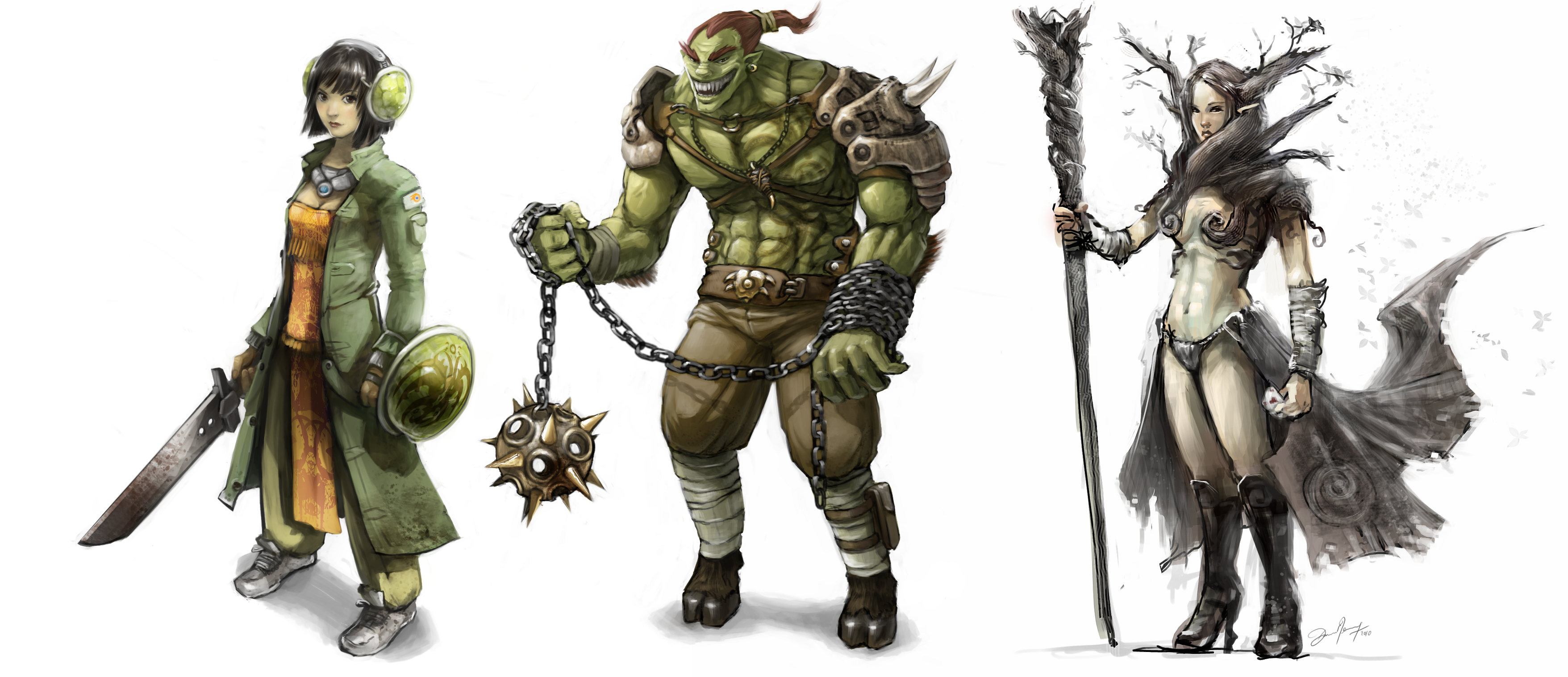
Examples of Character Illustration Done Well
Useful examples are less about copying a style and more about noticing the job the character is performing.
Duolingo: the character as brand voice
Duolingo’s Duo guidelines show a mascot used as an active part of the product voice, not just a sticker on the homepage. The character carries emotion, pacing, and encouragement. The important lesson is consistency: the poses, expressions, and usage rules keep the mascot recognizable even when the context changes.
Mailchimp: the character as memory device
Mailchimp’s brand assets page shows how Freddie functions as a memory marker inside a broader brand system. The mascot is distinctive, but it is kept in proportion to the typography, spacing, and product content. That balance matters. A character should strengthen recall, not hijack the page.
Boutique and portfolio sites: the character as a signature
Smaller creative brands often use illustrated self-portraits, mascots, or recurring figures to create continuity across Home, About, and service pages. This approach can be especially effective for stylists, illustrators, boutique shops, and educational creators because it makes the brand feel authored rather than assembled from stock components. The failure mode is predictable: too many characters, too many styles, and no clear hierarchy. One strong figure will usually do more work than a crowded cast.
Implementation Rules That Keep the Design Useful
If you are planning to add character illustrations to a site, keep the rollout methodical:
- Define the role first. Decide whether the character is leading, supporting, or purely decorative.
- Keep the visual language consistent. Match line quality, palette, and expression range across pages.
- Test mobile layouts early. Characters that feel balanced on desktop can crowd copy on smaller screens.
- Pair the artwork with clean copy. Expressive visuals work best when the text stays direct.
- Document usage rules. Even a small site benefits from a baseline on scale, spacing, crops, and alt-text treatment.
Design resources can help with exploration, but they should not replace judgment. The unDraw illustration library is a practical reference for studying pose variety, composition, and simplified shapes. It is most useful as a study aid or starting point for visual direction, not as an excuse to skip the harder brand decisions.
Conclusion
Character illustration matters in web design because it helps a site do three jobs at once: hold attention, clarify tone, and strengthen brand memory. The best results come from restraint. Choose a style that fits the audience, define the role it should play on the page, and keep the implementation consistent enough that the artwork feels intentional rather than improvised.
Before adding a character to your next layout, verify the baseline: what should the figure communicate, where should it appear, and how will it behave on mobile? Answer those questions first. The illustration can then support the system instead of becoming another preventable failure mode.