Building an e-commerce website does not have to feel like assembling furniture without the instructions page. If you know what you are selling, who you are selling to, and how you want the store to behave, the process becomes much more manageable. I like to think of it as building a tiny city for shopping: there is a storefront, a checkout lane, a delivery system, and a lot of tiny decisions that make the whole thing either smooth or mysteriously annoying.
When people start searching for help with an online store, they usually want the same handful of answers: How do I choose a platform? How do I make the site look trustworthy? How do I get customers to find it? And, most importantly, how do I avoid creating a digital maze where products vanish like socks in a dryer? Steve Jobs put the design problem bluntly: “Design is not just what it looks like and feels like. Design is how it works.”
This matters because e-commerce lives or dies on usability. Google’s guidance on product structured data shows how search engines read product pages, while Shopify’s guide to starting an online store is a good reminder that a store needs more than a checkout button and a dream. I also keep WooCommerce’s getting started documentation nearby when I want a practical platform reference. If you are building from scratch, the path is simple enough once the pieces are named out loud.
In the next sections, I’ll walk through what an e-commerce site actually is, how to choose a platform without losing a weekend to comparison tabs, what design choices make shoppers trust you, and which marketing moves help people actually arrive at the store. I’ll keep the jargon in the closet and use the kind of explanations that make a beginner feel capable instead of vaguely hunted.
Here is the short version of the job: define the store, choose the stack, shape the customer experience, and then put traffic-generating systems in place. That is the whole game, although each step comes with enough sub-decisions to keep the internet employed for centuries.
What an E-commerce Website Actually Is
An e-commerce website is a website that lets people browse, compare, choose, and buy products or services online. That sounds obvious, but the word “e-commerce” covers more than a checkout page with a pretty button. It includes product pages, shopping carts, payment processing, shipping or delivery rules, taxes, customer accounts, order confirmation emails, and the quiet back-office machinery that keeps the whole thing from collapsing into a pile of abandoned carts.
I usually break the model into a few common categories because that helps people understand what they are really building:
| Model | What it means | Example use case |
|---|---|---|
| B2C | Business to consumer. You sell directly to individual shoppers. | A boutique clothing store or handmade candle shop. |
| B2B | Business to business. You sell to other businesses in larger or recurring orders. | Wholesale packaging, office supplies, or recurring service bundles. |
| DTC | Direct to consumer. The brand owns the relationship and sells without a middle layer. | A niche skincare brand or independent apparel label. |
| C2C | Consumer to consumer. Individuals sell to other individuals through a platform. | Marketplaces, resale, or peer-to-peer listings. |
| Subscription | Customers pay on a recurring schedule for products or access. | Meal kits, memberships, or monthly product boxes. |
The reason this matters is simple: the model changes the features you need. A subscription store needs renewal logic and account management. A B2B catalog may need quote requests and custom pricing. A small B2C shop may need speed, trust, and great product photography more than it needs a complicated account portal. The shape of the business determines the shape of the site.
The benefits of building an e-commerce site are practical, not mystical. You can sell beyond your local area, accept orders 24/7, collect better customer data, and present your brand on your own terms instead of relying entirely on a marketplace that can change the rules mid-season. That control is the boring magic people forget to mention, and boring magic is usually where good businesses live.
For many small businesses, the website becomes the center of the operation. Social media may spark interest. Email may nudge repeat visits. Paid ads may bring in a new audience. But the website is where the buying decision finally happens. If the site is confusing, slow, or strangely suspicious-looking, the customer will treat it like a store with flickering lights and politely walk away.
Choosing the Right Platform
This is the part where beginners often freeze because every platform seems to offer freedom, speed, and magical simplicity, which is marketing language for “please do not look too closely at the trade-offs.” I start platform selection by asking five questions:
- How many products am I selling now, and how many might I sell later?
- Do I want managed hosting, or do I want more technical control?
- How much time do I want to spend on updates and maintenance?
- Do I need blog content and product pages in one place?
- Will I need custom workflows, dashboards, or admin tools as I grow?
For a beginner, the usual suspects are Shopify, WooCommerce, BigCommerce, and Squarespace Commerce. Each one can work well, but they solve the problem in different ways.
| Platform | Best for | Strengths | Trade-offs |
|---|---|---|---|
| Shopify | Fast launch and minimal technical fuss | Managed hosting, polished checkout flow, many apps | Monthly cost and less direct control over the stack |
| WooCommerce | WordPress users who want flexibility | Highly customizable, content and store can live together | More maintenance and plugin management |
| BigCommerce | Stores that may scale into larger catalogs | Built-in commerce features and strong catalog tools | Can feel less flexible in theme and design choices |
| Squarespace Commerce | Simple stores with a design-first approach | Easy visual editing and elegant templates | Not always ideal for large or highly custom catalogs |
If you want a quick rule of thumb, I use this one: choose the platform that makes the next twelve months of work easier, not just the next twelve minutes. Beginners often pick the cheapest option and then pay for it in confusion. Others choose the most powerful option and then spend three days learning how to breathe inside the dashboard. Balance matters.
When I need a platform for a store plus content marketing, WooCommerce is often the most natural fit because it keeps the website and the blog under the same roof. If I need the fastest possible launch and the least maintenance, Shopify is usually the smoother road. If I know the business will need custom internal workflows too, a web app generator can be a useful way to prototype admin tools, order trackers, or simple business apps without starting from an empty screen.
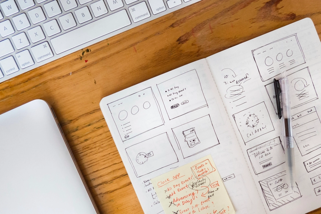
A useful test is to sketch the store before you build it. If you can describe the homepage, category pages, product pages, cart, checkout, and confirmation flow in plain language, you are ready to start. If you cannot, the platform choice is probably not the real problem yet. The structure is.
Design Considerations That Make the Store Feel Trustworthy
Design is where the store starts to feel real. A great e-commerce site does not just look pretty; it helps shoppers understand what you sell, why they should trust you, and how to buy without getting lost in decorative nonsense. I think about e-commerce design in layers: clarity, speed, hierarchy, and reassurance.
Responsive design is non-negotiable. A store that only behaves nicely on desktop is quietly telling mobile visitors to leave. Since most people browse on phones some or all of the time, your layout, buttons, forms, and product cards need to adapt gracefully. I like MDN’s guide to using media queries because it explains the mechanism behind that flexibility without turning the page into a lecture hall.
Here are the design questions I ask on every store project:
- Can a new visitor tell what the store sells within five seconds?
- Is the primary navigation short, clear, and labeled in human language?
- Do product pages show enough photos, details, and prices to support a decision?
- Does the cart feel like a natural next step, not a hidden tax document?
- Does checkout remove friction instead of inventing new ways to create it?
One of the easiest beginner mistakes is to make the homepage do too much. A homepage is not a junk drawer. It should guide people to the right category, showcase a few hero products or collections, and answer the trust questions that pop up before a purchase: Who are you? Do you ship where I live? Can I return this? Is this business real? The layout should answer those things without making visitors scroll like they are training for a fitness challenge.
Product pages deserve special attention. I want three things above the fold whenever possible: a strong product image, a clear price, and a direct call to action. Below that, I want the useful details that remove hesitation: sizing, materials, dimensions, shipping notes, stock status, and a short description written for people, not robots. Search engines can read structure, but shoppers can feel whether the page was designed by a human who actually expected a purchase to happen.
Visual style matters too. Color, typography, and spacing should support the brand instead of fighting it. For a boutique or lifestyle brand, a softer palette and generous white space may feel right. For a more energetic brand, bolder contrast and sharper layout choices might be better. The rule is not “make it trendy.” The rule is “make it coherent.” Trendy without coherence is just expensive confusion with better fonts.
Images are especially important in e-commerce because shoppers cannot touch the product. Use multiple angles when you can. Show scale. Show texture. Show context. A bag on a white background tells one story; the same bag in use tells a different one. The best stores I have seen make image choice feel intentional rather than decorative. Good product imagery reduces doubt, and doubt is the enemy of checkout.
Accessibility matters here too. Use readable contrast. Make buttons large enough to tap. Write alt text that describes the product or scene clearly. Keep forms short and labels obvious. Accessibility is not a side quest. It is the difference between a site that welcomes shoppers and one that quietly blocks them with bad assumptions.
How I Plan the Site Structure Before I Build
Before I open a builder or edit a theme, I map the store like a route plan. I want to know what the user sees first, what they see next, and what happens after they click “Buy.” That way, I am designing the path instead of decorating the walls and hoping people find the door.
A basic structure for a beginner-friendly e-commerce website usually looks like this:
- Homepage with a clear value proposition.
- Category or collection pages that organize the catalog.
- Product pages with photos, benefits, and practical details.
- Cart page that summarizes the order clearly.
- Checkout page with minimal friction and visible trust cues.
- Confirmation page with order details and next steps.
If I can get those six pages right, the rest becomes much easier. That is also the place where internal support pages matter. A visitor who wants help should not have to hunt through a maze. If you need a practical contact path, the Contact page should be easy to find and should clearly tell people how to reach you. If you need help scoping the store, a planning conversation through the Services page can keep the project from drifting into “we’ll know it when we see it” territory.
Here is a simple launch checklist I use when I want to stay sane:
| Area | What to confirm |
|---|---|
| Catalog | Products, prices, variants, inventory, and categories are complete. |
| Payments | Cards, wallets, and any local payment methods are tested. |
| Shipping | Rates, regions, packaging assumptions, and delivery times are clear. |
| Policy pages | Returns, privacy, terms, and cookies are visible and current. |
| Email flows | Order confirmations, shipping updates, and abandoned cart emails are working. |
| Analytics | Tracking is installed so you can see what people actually do. |
That checklist sounds boring because it is boring, and boring is exactly what makes it valuable. The flashy part of e-commerce is the hero banner. The profitable part is the system that prevents a customer from wondering whether you are a real business or a very determined mood board.
Marketing Strategies That Bring People to the Store
A beautiful store with no traffic is just a personal project with a checkout page. Once the site is live, marketing starts doing the heavy lifting. I treat marketing like a set of channels that all feed the same goal: help the right people discover the store, trust it, and return.
SEO basics come first. Every product page should have a clear title, a useful description, unique copy, and strong image alt text. Search engines need structure, and shoppers need meaning. Google’s product markup guidance is useful because it shows how product information can be surfaced in search results when the page is structured well. If your catalog is large, keep category pages descriptive too, because those pages often do a lot of discovery work before the product page gets a chance to shine.
Email is still one of the least dramatic and most effective channels. I know that is not glamorous. It is, however, true. Welcome emails, cart reminders, post-purchase follow-ups, and simple newsletters can all keep the store in front of people who already care. Mailchimp’s email marketing resources are a solid place to review the fundamentals if you are starting from zero and do not want your inbox strategy to look like a bad improv exercise.
Social media helps too, but I use it with a specific job in mind. Social is not the store. Social is the conversation that points people toward the store. That means product demos, behind-the-scenes clips, lifestyle images, and customer stories usually work better than posting a product photo and hoping the algorithm takes a personal interest. The internet is many things, but generous is not usually one of them.
Paid advertising can be useful when you already understand your product margins and have a clear landing page. If you run ads too early, you are just paying to discover that your offer is not ready. I prefer to start with a small, testable audience. Then I look at which products get clicked, where users bounce, and whether the ad promise matches the landing page reality. The click is not the win. The sale is the win. The click is just the door opening.
For beginners, I like to summarize the main channels like this:
| Channel | Best use | Starter move |
|---|---|---|
| SEO | Long-term discovery | Write unique product copy and add structured data. |
| Repeat visits and recovery | Create a welcome series and an abandoned cart flow. | |
| Social | Brand awareness and product storytelling | Post real product use, not just polished stills. |
| Paid ads | Targeted traffic and testing | Run one campaign around one audience and one offer. |
One more thing matters here: measurement. You do not need a graduate degree in analytics to begin, but you do need to know which pages people visit, where they drop off, and what products get attention. If a page gets traffic and never converts, that is useful information. It means the page is either misaligned, unclear, or asking for too much too soon. Data is not there to impress anybody. It is there to keep you from guessing in a fog.
A Practical Build Sequence for Beginners
If I were helping a beginner start today, I would build in this order:
- Define the product offer. Write down what you sell, who it is for, and why it exists.
- Choose the platform. Pick the option that matches your budget, timeline, and comfort level.
- Set the structure. Map homepage, categories, product pages, cart, and checkout before designing details.
- Build the store content. Add products, descriptions, images, shipping details, and policy pages.
- Design for clarity. Make navigation obvious, the mobile experience clean, and checkout friction light.
- Install analytics and SEO basics. Tracking, metadata, and structured product information should be in place before launch.
- Test the purchase flow. Place a few test orders, check email notifications, and verify that the customer journey works end to end.
- Launch with one or two marketing channels. Do not try to master every platform at once unless chaos is your brand strategy.
I like this sequence because it keeps the work grounded. Beginners often start with visual style because it is fun and immediately visible. That is understandable. But the store does not succeed because it looks good in a mockup. It succeeds when the catalog, navigation, checkout, and follow-up system all work together. Design supports the sale; it does not replace the sale.
Before I finish, I usually make one final pass through the entire experience and ask, “If I had never seen this business before, would I trust it enough to spend money here?” That question is a useful filter because it cuts through vanity choices. It makes you fix the missing shipping note, the awkward product label, the vague button text, and the checkout field that insists on being stranger than necessary.
Resources Worth Keeping Open in a Separate Tab
When I want to keep a project moving without overthinking it, I keep a few trustworthy references nearby:
- Google Search Central on product structured data for product page visibility.
- WooCommerce getting started documentation for WordPress-based stores.
- MDN on media queries for responsive layout work.
- Mailchimp email marketing resources for post-launch retention.
- Shopify’s online store guide for a broad beginner-friendly overview.
You do not need to use every tool or follow every trend. You need a store that is clear, credible, and easy to buy from. That is the tiny but useful truth hiding under all the platform chatter. Good e-commerce is not about being fancy for its own sake. It is about reducing friction between interest and action.
Conclusion
Building an e-commerce website becomes much less intimidating once you treat it as a sequence of decisions instead of a giant mysterious object. First define the business model. Then choose the platform that fits the work. After that, build a design that helps people trust the store and buy without friction. Finally, add the marketing systems that bring shoppers back through the door.
If I had to compress the whole guide into one sentence, I would say this: start small, structure the store carefully, and let each decision make the next one easier. That approach keeps the project from turning into a beautiful disaster with a cart icon. If you want help shaping the store, you can start with the Services page or send a note through the Contact page. Sometimes the cleanest way to build a store is to stop pretending you need to do every piece alone.
Key takeaways:
- An e-commerce website is a complete buying system, not just a product gallery.
- Platform choice should follow your budget, comfort level, and growth plan.
- Design should make the store feel clear, trustworthy, and easy to use on mobile.
- SEO, email, social content, and paid ads work best when the site itself is ready.
- A simple launch checklist protects you from the most embarrassing avoidable mistakes.