The right design tool will not sprinkle style dust on a website, but it will make good design decisions much easier to repeat.
If you are trying to build a site that feels current, expressive, and a little more alive than the average template, you are probably asking a few practical questions. Which tool helps me sketch ideas without getting lost in menus? Which one keeps my colors from turning into a pastel argument? Which builder lets me add motion without creating a small crisis on mobile? Paul Rand said it neatly: “Design is the silent ambassador of your brand.”
Those questions matter because visitors form opinions quickly, and visual polish affects how credible and usable a site feels. Nielsen Norman Group explains that people react to visual design almost immediately and that appealing interfaces can improve perceived professionalism and usability. Responsive behavior matters just as much, because a stylish layout that breaks on a phone is not stylish for long. Google’s web.dev guidance on responsive design is a good reminder that modern websites need to adapt cleanly across screens, not just look nice in a desktop mockup.
In this guide, I will walk through five tools that make a strong design stack for hip websites: one for layout, one for color, one for typography, and two for turning ideas into a live experience. You do not need all five on day one. What matters is choosing the smallest set of tools that helps you design clearly, stay consistent, and launch without drama.
What makes a design tool worth using?
Before getting into the list, it helps to define what “good” looks like here. A useful web design tool should do at least one of these jobs very well:
- Help you see layout problems early.
- Make brand decisions more consistent, especially for color and type.
- Reduce handoff friction between design, content, and launch.
- Save time on revisions instead of creating new layers of cleanup.
For beginners, I usually suggest picking tools that are easy to revisit a month later. A clever interface is not much help if it looks like a spaceship dashboard every time you reopen it.
Quick comparison table
| Tool | Best for | Standout strength | Watch-out |
|---|---|---|---|
| Figma | Wireframes, UI mockups, prototypes | Fast collaboration and responsive layout planning | Easy to over-design before content is ready |
| Adobe Color | Palette building and refinement | Harmony rules and image-based palette extraction | Needs taste and restraint to avoid too many colors |
| Google Fonts | Web-friendly typography | Huge library with easy web use | Too many choices can slow decisions |
| Framer | Expressive landing pages and portfolios | Smooth motion and fast publishing | Can tempt you to add animation everywhere |
| Webflow | Content-rich marketing sites and CMS builds | Strong visual builder with structured content tools | Steeper learning curve than simple site builders |
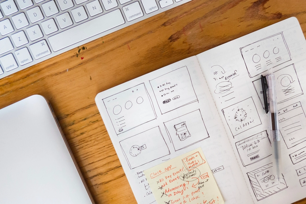
1. Figma for layout, mood, and early decisions
Figma is the tool I would choose first if I had to narrow this list to one essential starting point. It handles wireframes, polished mockups, clickable prototypes, shared feedback, and design systems in one place. For a hip website, that matters because style is usually a combination of small decisions: spacing, rhythm, image treatment, button shape, section contrast, and how everything behaves when the layout stretches.
Why it is useful: Figma helps you see those relationships before you commit to code. Features like components, reusable styles, and auto layout make it easier to keep a homepage, service page, and blog template feeling like they belong to the same brand family.
Best use cases: boutique service sites, creative portfolios, editorial layouts, landing pages with strong personality, and early redesign work where you need feedback before launch.
A practical tip: start with grayscale wireframes before you introduce color. If the page structure only works once it has gradients, stickers, sparkles, and emotional support shadows, the structure probably needs another pass.
Figma is also excellent when several people need to weigh in. A designer can shape the interface, a writer can check headline length, and a developer can flag spacing or responsiveness issues before the build phase turns into archaeology.
2. Adobe Color for palettes that feel intentional
Many trendy sites go wrong at the color stage. The idea is good, the layout is solid, and then suddenly every button is competing with the hero illustration like toddlers arguing over glitter. Adobe Color is a strong fix for that problem because it gives you a structured way to build and test palettes instead of guessing.
Why it is useful: You can start with a single base color, use harmony rules such as complementary or analogous schemes, and extract palette ideas from an image. That is especially handy for boutique brands, character-led websites, or girly design directions where you want personality without chaos.
Best use cases: brand refreshes, seasonal campaign pages, illustration-heavy homepages, and any project where color mood carries part of the message.
One practical approach is to limit yourself to this simple set:
- 1 primary brand color
- 1 accent color
- 2 neutral support colors
- 1 highlight color for calls to action
That is enough for most websites. More colors do not automatically make a site feel more creative. Often they just make the user work harder.
Adobe Color is especially helpful when you already have a hero image or illustration. Pull a palette from the image, then edit it down until the site still feels lively but no single section looks like it wandered in from a different event.
3. Google Fonts for typography that carries the brand
Google Fonts is one of the simplest tools on this list, and that is part of its charm. It gives you a large library of web-friendly typefaces that are easy to preview, compare, and use on live sites. For hip web design, typography does a surprising amount of heavy lifting. The right font pairing can make a clean layout feel editorial, playful, artsy, polished, or boutique before a visitor even reads the copy.
Why it is useful: It lowers the barrier to making good type choices. You can test headings, body text, weights, and spacing without fighting licensing paperwork or complicated install steps.
Best use cases: blogs, personal brands, online boutiques, service websites, and portfolio pages that need a distinct voice without custom lettering.
My practical rule for beginners is simple: use one display font and one workhorse font. The display font gives the site its personality. The workhorse font handles paragraphs, buttons, labels, and all the quiet jobs that make content readable. If you use three or four headline fonts at once, the page starts to sound like several people talking over each other.
Google Fonts is also useful for testing contrast between tone and readability. A playful heading can absolutely work on a stylish homepage, but your pricing table, blog cards, and navigation still need to behave like grown-ups.
4. Framer for expressive, motion-friendly websites
Framer is an excellent choice when the site itself needs to feel like part of the brand story. It is especially strong for portfolios, launch pages, studios, personal brands, and creative businesses that want motion, layered layouts, and a more editorial or experimental feel.
Why it is useful: Framer makes it relatively easy to create responsive pages with animation, visual rhythm, and polished transitions. When used well, motion can guide attention, create energy, and make a website feel more premium.
Best use cases: design studios, campaign microsites, visual portfolios, landing pages for creative offers, and brands that want a modern, expressive first impression.
The important tradeoff is restraint. Good motion should clarify what matters. It should not make the visitor chase floating elements around the screen like they owe them money. Use Framer for one or two signature interactions: a reveal, a hover treatment, a subtle parallax section, or a clean staggered entrance. That is usually enough to make a page feel current without slowing it down.
If your brand leans bold, artsy, youthful, or a bit theatrical, Framer is often the tool on this list that helps those qualities survive the trip from mockup to live page.
5. Webflow for visual building with structure
Webflow earns its place because it combines design freedom with a more structured publishing system. If Figma helps you decide what the site should look like, Webflow helps you build a real version while keeping control over layout, CMS content, and responsive behavior.
Why it is useful: It is strong for teams that want visual design control but also need repeatable content systems for blogs, service pages, case studies, or collections. That makes it a practical choice for brands that want a stylish website without turning every update into a developer ticket.
Best use cases: service businesses, boutique brands with growing content needs, editorial-style marketing sites, and design-forward businesses that want a visual builder with more structure than a basic drag-and-drop platform.
Webflow does ask a bit more from you than the easiest website builders. You will need to understand layout, spacing, and responsive behavior with some care. The payoff is that you can create systems, not just pages. For example, if you want a blog card design to repeat across dozens of posts, or you need portfolio entries to stay consistent as the site grows, Webflow is built for that kind of discipline.
It is a good fit when the website needs to look custom but still be manageable after launch. Stylish is nice. Stylish and maintainable is better.
How to choose the right mix
You do not need five subscriptions and a brave face. Most small teams can start with a lighter stack based on the kind of site they are making.
If you are designing a creative portfolio
- Use Figma for structure and early mockups.
- Use Adobe Color to refine the palette.
- Use Google Fonts to lock in typography.
- Use Framer if motion and visual personality are central to the experience.
If you are building a boutique service website
- Use Figma to map the homepage, services, and calls to action.
- Use Adobe Color and Google Fonts to make the brand consistent.
- Use Webflow if you need more content structure and repeatable sections.
If you are prone to tool overload
- Start with Figma and Google Fonts.
- Add Adobe Color when your palette feels muddy.
- Add Framer or Webflow only when you know how you want the site to behave live.
The goal is not to collect tools. The goal is to remove uncertainty at each stage: layout, color, type, and launch.
Common mistakes when choosing design tools
- Picking a tool because it is popular, even though it does not match the project.
- Adding too much animation before the layout is stable.
- Using too many fonts or accent colors in the name of creativity.
- Skipping mobile checks until the end.
- Expecting one tool to handle every step perfectly.
If you want a practical next step, open one current page on your site and evaluate it in this order: layout first, color second, typography third, motion fourth. That order is not glamorous, but it saves a lot of avoidable rework.
A simple workflow from blank page to live site
If you are wondering how these tools fit together in real life, here is a practical sequence that keeps the process manageable.
Step 1: Sketch the structure in Figma
Start with the bones of the page: hero, value proposition, proof, services, call to action, and footer. Do not worry about making it beautiful on the first pass. Your first job is to make sure the content has a clear path and that the page does not ask the visitor to solve a puzzle before breakfast.
Step 2: Build a disciplined palette in Adobe Color
Once the layout works, choose the color direction. Pull from an illustration, product photo, or brand reference if you have one. Narrow the palette until every color has a job. Primary means primary. Accent means accent. If six colors are all trying to be the main character, none of them are helping.
Step 3: Pair your fonts in Google Fonts
Test your headline font and body font on real copy, not lorem ipsum. A font can look charming in a specimen view and then become surprisingly unhelpful when it has to explain pricing, navigation, or a contact form. Check headline length, paragraph density, and mobile readability before you decide the type system is done.
Step 4: Choose your launch tool based on site behavior
If the site needs bold motion and strong personality, Framer is often the easier fit. If the site needs repeatable content structures, CMS collections, and a more system-driven build, Webflow is usually the steadier choice. This is the main tradeoff to understand: Framer is often the faster route to expression, while Webflow is often the safer route to structure.
Step 5: Test the homepage on a phone before celebrating
Every stylish desktop design deserves one honest mobile check. Look at button size, heading breaks, image crops, menu behavior, and section spacing. Many websites feel “almost done” right before this step. That is normal. It is also why this step should happen before launch, not after a friend texts you a screenshot.
This workflow is not fancy, but it does protect you from a common problem: choosing tools in the wrong order. When people start with animation before layout, or launch before type is settled, the cleanup usually costs more time than the original design work. A calm sequence beats an exciting mess almost every time.
If you are comparing options for a redesign, our services page gives a quick overview of the kinds of website work we support, and the blog has more practical articles on design, branding, and content planning.
Final thoughts
A hip website is usually not the result of one magical app. It is the result of a few good tools used with taste and consistency. Figma helps you think clearly. Adobe Color keeps your palette disciplined. Google Fonts shapes the voice. Framer adds energy. Webflow brings structure to the live experience, especially as content grows.
If you are unsure where to begin, start with the tool that solves your next real problem, not the one with the flashiest demo. That one decision will usually make the rest of the stack much easier to choose.
Key takeaways:
- Strong web design tools improve consistency, not just appearance.
- Figma is the best all-around starting point for layout and collaboration.
- Adobe Color and Google Fonts help brand choices feel intentional instead of improvised.
- Framer is great for expressive, motion-led sites.
- Webflow is a strong option when design freedom and content structure both matter.