2024 web design was not about piling on more effects; it was about choosing better ones. If you are trying to decide what belongs in a modern layout, the useful questions are still the practical ones: What makes a page feel current? What helps people move faster? What looks fresh today and will still make sense six months from now?
Two sources point in the same direction. Google’s performance guidance keeps reminding teams that speed and stability are part of the user experience, not a bonus round, while NNGroup’s accessibility research makes it clear that contrast, dark mode, and interaction states should support real use. That is the real filter for trends: if a visual choice slows people down or makes content harder to read, it is decoration with a short shelf life. web.dev’s performance guidance and NNGroup’s dark mode research are worth keeping open in a second tab.
This article looks at the trends that matter most for 2024: cleaner minimal layouts, dark mode and high contrast, and more interactive content. I will also show how to apply each one without turning a good site into a trendy outfit that no longer fits by next quarter. Nobody needs that kind of wardrobe malfunction on a homepage.

| Trend | Why it matters | First practical move |
|---|---|---|
| Minimalism and clean design | It helps pages feel calmer, faster, and easier to scan. | Remove one secondary element from your hero section and see what clarity improves. |
| Dark mode and high contrast | It supports user preference, accessibility needs, and a more polished visual system. | Respect the system color preference before you add a custom toggle. |
| Interactive and dynamic content | It gives the page a sense of motion and feedback without forcing people to guess what is clickable. | Audit hover states, focus states, and one small interactive pattern on your most visited page. |
Trend 1: Minimalism and clean design
Minimalism did not disappear in 2024. It simply got more disciplined. The best minimalist sites use fewer visual styles, fewer competing messages, and more deliberate spacing so the important part of the page can do its job. That does not mean empty layouts or cold interfaces. It means editing with intent.
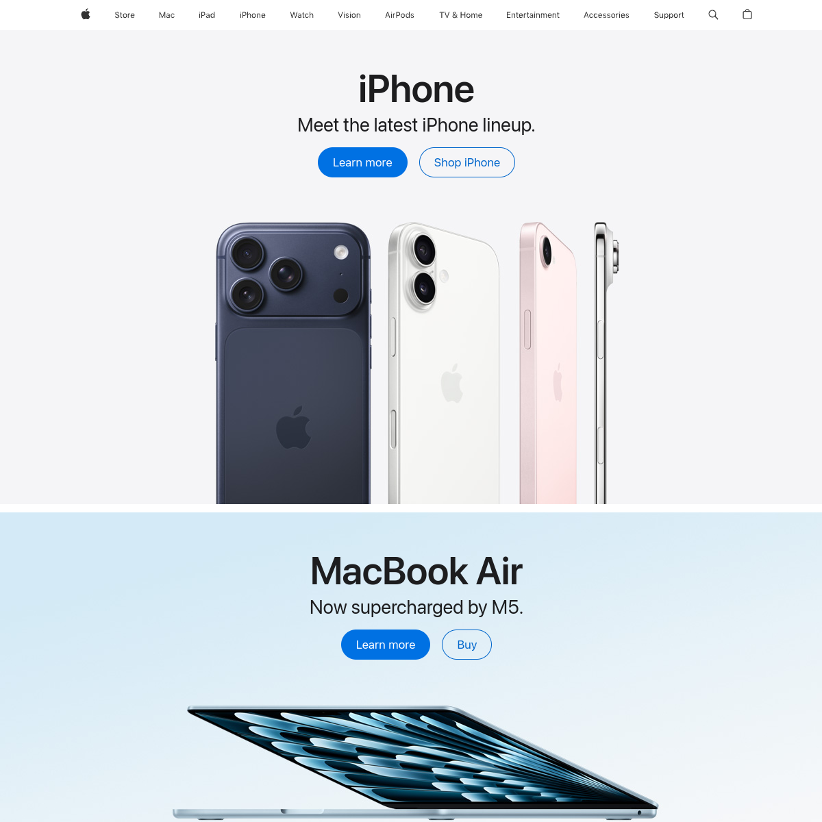
Look at Apple, Stripe, and Notion. They each use restraint differently, but the pattern is similar: one clear headline, a short path to action, and enough breathing room to make the content feel easy to process. The details vary, but the principle is the same. The page gives the eye less to fight with.
There is also a practical business reason to keep things lean. Google’s mobile research famously found that 53% of mobile site visits are abandoned when a page takes longer than three seconds to load. That is not a styling opinion; it is a reminder that clutter often has a performance cost. See Google’s mobile speed research and web.dev’s performance guidance for the broader case.
What this means in practice:
- Use one primary call to action in the hero area.
- Limit the number of fonts, accent colors, and button styles.
- Use whitespace as a layout tool, not just empty space.
- Keep copy short, but not vague. A page can be minimal without becoming mysterious.
- Review every decorative asset and ask whether it adds meaning or just fills a gap.
Minimalism works best when it is a filter, not a fashion filter. If a block of content is useful, keep it. If it only makes the page feel busier, remove it or move it somewhere that earns its place better.
Trend 2: Dark mode and high contrast designs
Dark mode continued to move from “nice extra” to “expected option” in 2024. That does not mean every site should ship a black interface. It means users increasingly expect the design to respect their system settings, their environment, and their preference for less glare at certain times of day.
Good examples include Discord, Spotify, and many parts of Apple. These brands use dark surfaces in ways that feel purposeful, not gimmicky. The key is not “make it black.” The key is “make it readable, controlled, and consistent.”
NNGroup’s research on dark mode is a helpful reality check. Their summary is straightforward: users with normal vision often perform better in light mode, while some users with visual impairments may benefit from dark mode. In other words, dark mode can be useful, but it should not replace accessibility judgment. A beautiful low-contrast interface is still low-contrast. The browser does not award style points for that.
That research also points to a sensible rule: respect the system preference rather than forcing a single look on everyone. If you are building for a broad audience, support both modes when you can, and test the contrast of actual content rather than just the palette swatches.
In NNGroup’s survey of 115 mobile users, roughly one-third said they generally use dark mode, one-third said light mode, and one-third said they move between both. That split is useful because it shows the audience is not uniform. A design system that follows prefers-color-scheme and still offers a manual override covers both the people who want the room dim and the people who would rather keep the lights on. The goal is not to choose a winner; it is to keep the page comfortable without making the interface feel moody for sport.
- Check body text, link color, form labels, and error states in both themes.
- Verify icons, charts, and illustrations stay readable when the background changes.
- Confirm the toggle, if you add one, remembers the visitor’s choice on return visits.
Practical implementation tips:
- Start with the operating system preference before adding a manual toggle.
- Avoid pure black and pure white if they create harsh glare; use softer surfaces and strong contrast instead.
- Check text on top of images, gradients, and cards in both modes.
- Test buttons, links, form fields, and focus rings in dark mode, not just headlines.
- Make sure illustrations, icons, and logos remain legible when the background changes.
If the page gets prettier in dark mode but harder to use, the design has taken the wrong turn. Style should lower stress, not make people squint harder.
Trend 3: Interactive and dynamic content
Interactive design in 2024 was less about flashy motion and more about useful feedback. The best sites now feel alive because they respond clearly when you hover, tap, filter, scroll, or search. That includes small things like button states and bigger things like maps, calculators, progress indicators, and personalized content blocks.
Current examples include Airbnb, where search and map behavior guide choices; Apple, where product pages often use motion to explain a feature; and Framer, where the experience itself demonstrates the value of motion and responsiveness. These examples are useful because the interaction is not random. It serves understanding.
There is also evidence that teams are not treating interactive content as a novelty. Content Marketing Institute’s 2025 benchmark found that 27% of B2B marketers used interactive content, which suggests the format has moved into the mainstream rather than remaining a special campaign idea. See CMI’s benchmark report for the broader adoption picture.
Useful interactive patterns for smaller sites:
- Hover states that explain what a link or card will do.
- Accordion sections for compact FAQs and support content.
- Simple calculators or quote estimators for service pages.
- Progress bars and step indicators for forms or checkout flows.
- Scroll-triggered reveals that clarify, rather than distract from, the message.
Interactive content works when it reduces uncertainty. If a visitor can understand the next step more quickly because the page responds clearly, the interaction has done its job. If it just jiggles, it is a party trick.
How to apply these trends without overdoing it
Trends are useful when they solve a problem you actually have. The fastest way to make a design look outdated is to use every current idea at once and hope they get along. They usually do not.
| Design decision | Good question to ask | What to avoid |
|---|---|---|
| Spacing | Does the page feel easier to scan after this change? | Random whitespace that does not create hierarchy. |
| Color | Does this palette improve clarity in both light and dark mode? | Low-contrast text dressed up as “premium minimal.” |
| Motion | Does the animation explain, confirm, or guide the next action? | Movement that steals attention from the content. |
| Content density | Does the page answer the visitor’s first question quickly? | Trying to make one page do the work of five. |
If you are trying to decide where AI belongs in your design process, a neutral outside perspective can help. AI consulting services can be useful when a team needs to turn scattered ideas into a practical roadmap before adding another tool to the workflow. The same logic applies to design trends: define the problem first, then choose the technology or pattern that actually helps.
For a small team, the most useful workflow is usually this:
- Pick one page that gets enough traffic to matter.
- Apply one trend at a time.
- Check accessibility, loading behavior, and readability on mobile.
- Watch for confusion in analytics, support requests, or user feedback.
- Keep the change if it helps, and roll it back if it only looks clever in a mockup.
What to watch next
There is a reason these trends keep showing up together. Minimalism reduces unnecessary noise, dark mode gives users more control over how they consume content, and interactive patterns make the page feel more responsive to human intent. Put differently: each trend tries to make the interface less tiring to use.
That matters for any business site, but it matters even more for smaller brands that have to earn trust quickly. Visitors do not have time to decode a homepage that behaves like a puzzle box. They want a clear message, a readable layout, and a next step that feels obvious.
If you want a broader view of good design habits, keep reading the blog index and compare these ideas with the work on the services page. If you are planning a redesign, that is the sensible place to check what help is available before you start rearranging the furniture.
Conclusion and resources
Web design trends to watch in 2024 were not a complete break from the recent past. They were a refinement of what already works: cleaner layouts, better contrast, and interactions that help people understand what to do next. The sites that will age well are the ones that use these ideas with restraint and purpose.
My short version is this: keep the layout simpler than your first instinct, support dark mode without sacrificing readability, and use interactive elements to guide the reader rather than impress them. That is a calmer way to build, and usually a better one too.
Further reading:
- web.dev performance guidance
- NNGroup on dark mode and user expectations
- W3C guidance on contrast minimum
- Content Marketing Institute’s interactive content benchmark
Key takeaways: minimalist layouts still matter, dark mode needs contrast and restraint, and interactive content should create clarity rather than noise. If a design choice does not help the visitor understand the page faster, it probably belongs in the sketchbook a little longer.