A cohesive brand identity is what turns a website from “nice-looking pages” into a recognizable brand that feels like it knows exactly who it is and why it exists.
When people search for brand identity help, they usually have the same cluster of questions: Why does my site look good in pieces but messy as a whole? What should the logo, colors, fonts, and photography all be saying together? How do I keep the design polished without making the site feel stiff? And why does the mobile version suddenly act like it has never met the desktop version in its life?
Those are real problems, not design melodrama. The W3C’s guidance on contrast minimum is a good reminder that visual decisions have to support legibility, not just mood. And Google’s Google Fonts library makes the same larger point in a friendlier way: type choices become useful only when they are tested in real layouts, on real screens, with real content. That is the whole game here. Pretty is welcome. Coherent is better.
In this guide, I will break down what brand identity means, the elements that make it feel cohesive, how a website should reinforce that identity, and what strong brands do well online. I will also give you a practical checklist you can use on your own site right after you finish reading. If you want more context on the brand behind this site, the About page is a good place to start, and the Services page shows how visual decisions turn into actual work.
Here is the short version of what you will get from this article:
- A plain-English definition of brand identity and related terms.
- A framework for building consistency across logo, color, typography, voice, and imagery.
- Practical website design habits that make the brand feel unified instead of patched together.
- Examples of brands that handle identity well online without losing personality.
- A quick audit checklist you can use on your own site today.
What Brand Identity Means Online
Brand identity is the full set of signals a business uses to be recognized and remembered. That includes visual elements like the logo, color palette, typography, and imagery, but it also includes voice, structure, pacing, and the overall feeling a visitor gets while moving through the site. If branding is the promise, identity is the way the promise shows up in public.
Online, brand identity matters because visitors do not experience your business in one neat conversation. They see the homepage, the mobile menu, the service descriptions, the social preview image, the checkout flow, the email signup, and maybe three different versions of the footer if the website has been through one too many “quick fixes.” Cohesion is what keeps all those moments from feeling like different people running the same account.
Paul Rand put it simply: “Design is the silent ambassador of your brand.” That line still lands because visitors make judgments fast. They notice whether the site feels calm or noisy, premium or casual, friendly or distant, structured or improvised. Brand identity shapes those judgments before the first paragraph even gets a chance to introduce itself.
Key Terms, Without The Fog Machine
I like to define a few terms before diving deeper, because branding conversations can get slippery fast. People often use these words as if they mean the same thing, and then everyone nods politely while secretly wondering what just happened.
| Term | Plain definition | Why it matters |
|---|---|---|
| Brand identity | The visible and verbal system that represents the brand consistently. | It makes the brand recognizable across pages, platforms, and touchpoints. |
| Brand voice | The way the brand sounds in writing. | It gives the site a human personality instead of corporate wallpaper. |
| Visual system | The repeated design rules for color, type, imagery, spacing, and layout. | It keeps the site from looking like every page was designed by a different mood. |
| Consistency | Using the same design logic across the whole experience. | It builds trust because visitors do not have to re-learn the site on every page. |
| Hierarchy | The order of what people should see first, second, and third. | It helps the visitor scan instead of wandering around like a confused raccoon. |
If you remember nothing else from this section, remember this: identity is not a single asset. It is a pattern. The more repeatable the pattern, the more quickly people can recognize the brand without needing a guided tour.
The Five Elements Of A Cohesive Brand Identity
When I build a brand system, I usually think in five layers. If one layer is strong and the others are random, the identity wobbles. If all five are making the same argument, the site starts to feel intentional.
1. Logo Design
The logo is not the whole brand, but it is the quickest visual shorthand people use to identify it. A good logo should be legible at small sizes, flexible enough to work on a header or social card, and distinctive enough that it does not disappear into the background of the internet’s very large “I have seen this before” folder.
For online use, the logo should also have a few practical variations: a full version, a compact version, and maybe an icon or mark that can survive small screens. If your logo falls apart in a browser tab or looks awkward inside a mobile header, the site is already doing extra work for the wrong reason.
2. Color Palette
Color is usually the first place people notice brand mood. It can make a site feel warm, bold, soft, playful, luxurious, or minimal within seconds. That is also why color is dangerous when it is chosen by committee, trend panic, or a single “I like this shade” opinion that somehow escaped into production.
A cohesive palette usually includes:
- One primary color that leads the identity.
- One or two support colors that expand the range.
- One dark text color that keeps reading comfortable.
- One light neutral that gives the layout breathing room.
- One accent color used sparingly for calls to action or emphasis.
The W3C contrast guidance matters here because beautiful color combinations still have to support real reading conditions. A pale pink button on a pale cream background may be adorable in a mockup and nearly invisible in practice. A brand identity that cannot be read is just a decorative misunderstanding.
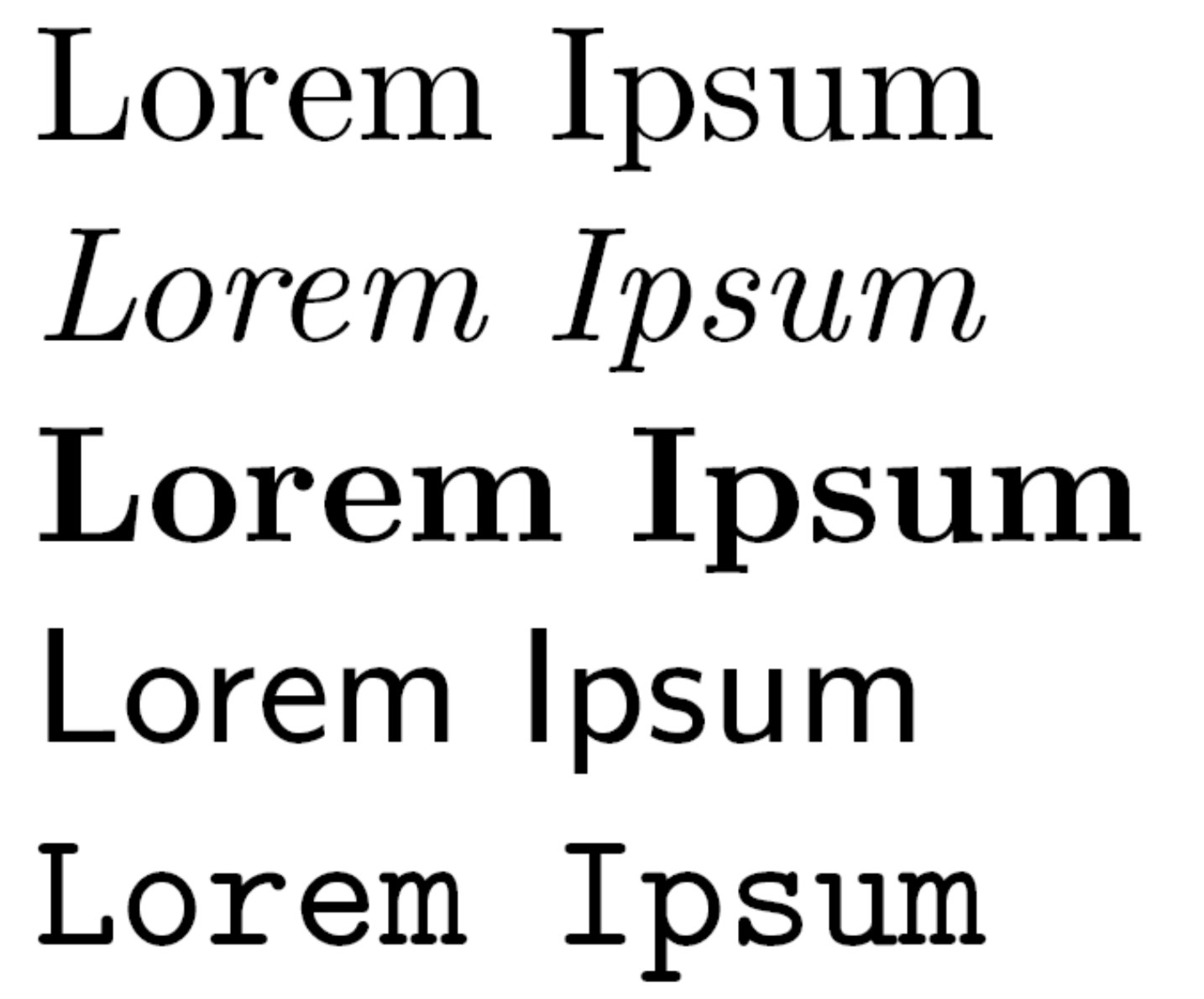
3. Typography
Typography gives the brand its rhythm. It tells visitors whether the site feels editorial, playful, premium, technical, feminine, modern, or some carefully controlled mix of those. The font is not just a styling choice. It affects how fast people can scan, where their eye lands first, and how much effort the page asks from them.
For most websites, the safest structure is simple: one expressive font for headlines and one highly readable font for body text. That pairing gives the brand personality without turning every paragraph into a decoding exercise. Google Fonts is useful here because it lets you compare real combinations instead of guessing based on one pretty specimen view.
4. Tone Of Voice
Tone of voice is the written version of the brand’s posture. It can be playful, calm, elegant, practical, witty, warm, or direct. The important thing is not choosing the “best” tone in the abstract. The important thing is choosing a tone that matches the audience and the offer, then using it consistently from headlines to button labels to form confirmations.
A boutique brand may sound polished but approachable. A creative studio may sound clever without becoming vague. A service business may sound reassuring without becoming sleepy. The voice should make the brand feel like a person with a point of view, not a brochure that swallowed a clipboard.
5. Imagery And Graphics
Imagery is where many brands either become memorable or become generic with good lighting. Photos, illustrations, icons, textures, and graphic accents should all support the same mood. If the site uses airy editorial photography on one page and loud cartoon icons on another with no shared logic, the identity starts arguing with itself.
That does not mean everything has to match in a boring way. It means the images should share a visual language. Maybe the photography is soft and natural. Maybe the illustrations are hand-drawn. Maybe the shapes are rounded and friendly. Maybe the textures are subtle and tactile. The brand does not need one look for every section, but it does need one point of view.
How To Design A Website That Actually Reflects The Brand
This is where the pretty parts and the practical parts need to shake hands. A website should not merely show the brand identity. It should organize that identity so visitors can recognize it quickly and move through it easily.
Start With The Brand Promise, Not The Layout
Before choosing a template or opening a design file, ask what the brand should feel like in one sentence. Calm? Luxe? Playful? Warm? Smart? Minimal? Boutique? Once that feeling is clear, design decisions become much easier because you have a filter. Every color, font, and image has to answer a simple question: does this support the brand promise, or is it just standing there looking expensive?
This is where many websites get off track. They pick a nice template first and then ask it to become the brand. That can work if the template is flexible and the brand is simple, but more often it produces an identity that feels borrowed. Brand identity works best when the message leads and the layout follows.
Build A Repeatable Page System
A cohesive website usually uses the same section logic across pages. For example:
- Clear headline that states the main idea.
- Short supporting paragraph that adds context.
- Proof or example that builds trust.
- Service, product, or content block that explains the offer.
- Call to action that makes the next step obvious.
That pattern creates familiarity. Visitors do not have to relearn the site on every click. They know where to look, how the page is likely to behave, and what kind of information comes next. Familiarity is not boring when the brand has personality. It is comfort.
Keep The Design Rules Consistent Across Devices
Brand identity gets tested the hardest on mobile because the layout loses space fast. A hero section that feels graceful on desktop can become crowded on a phone. A beautiful type pair can collapse if the line breaks get strange. A decorative graphic can suddenly cover the headline like it is trying to win an argument.
When I review responsive design, I look at four things first: text size, image crop, spacing, and button clarity. If those are consistent, the mobile version usually stays aligned with the brand instead of feeling like a smaller and slightly more stressed cousin of the desktop site.
Let The Interface Copy Match The Brand Voice
Headers, buttons, form labels, error messages, and callouts are tiny but powerful identity cues. A playful brand can still be clear. A refined brand can still be warm. A practical brand can still sound human. The trick is to avoid tone drift.
For example, if the homepage feels elegant and boutique, but the contact form says “SUBMIT YOUR INFO NOW!!!” the brand suddenly has the energy of a department store intercom. Tiny pieces of copy matter because they show whether the brand system is actually consistent or just cosmetically consistent.
Use Imagery As A System, Not A Mood Board Grab Bag
One of the best ways to strengthen identity is to give images rules. Use the same editing style, the same lighting direction, the same illustration line weight, or the same framing logic across pages. That repetition makes the brand feel intentional instead of assembled from five different Pinterest boards that have been politely told not to fight in public.
If you need a useful mental shortcut, ask whether a new image could belong to the brand without looking at the logo. If the answer is no, the image may be pretty but not yet on-brand.
A Simple Brand Identity Map For Your Website
When I want to check whether a brand system is coherent, I use a quick map. It is not fancy, but it is extremely useful because it forces the elements to work together instead of being evaluated in isolation.
| Brand element | What it should do | Quick test |
|---|---|---|
| Logo | Identify the brand quickly and flexibly. | Does it still work in a header, favicon, and social preview? |
| Color | Create mood and guide attention. | Do the key calls to action stand out without screaming? |
| Typography | Set rhythm, hierarchy, and readability. | Can a visitor scan the page in a few seconds? |
| Voice | Make the brand sound like one recognizable personality. | Would the copy still sound like the same company on every page? |
| Imagery | Reinforce the same visual mood and level of polish. | Do the images feel like they belong to one visual family? |
| Layout | Organize the content so the brand is easy to experience. | Do sections repeat cleanly, or does every page improvise? |
If you run this map across a website and two or three rows feel out of tune, that is usually where the identity is leaking. The good news is that leaks are easier to fix than entire floods.
Case Studies Of Successful Brands
Case studies are helpful because they show how identity behaves in the wild. A strong brand is not just an attractive homepage. It is a system that stays recognizable even when the content changes or the layout gets more complicated.
Apple: Restraint That Still Feels Premium
Apple is the obvious example for a reason. The brand uses restraint as a design tool. The site leans on strong product imagery, very controlled typography, a limited color story, and layout discipline that makes each section feel deliberate. The result is a site that feels premium without shouting about being premium every five seconds.
Apple’s website is worth studying because the visual language remains consistent even as product pages change. The identity is recognizable through spacing, photography, type treatment, and the overall confidence of the layout. It is a useful reminder that minimal does not mean empty. It means every element has to earn its place.
Airbnb: Friendly And Human Without Losing Structure
Airbnb handles brand identity differently. The experience feels warmer and more community-driven, with soft visual cues, approachable language, and an interface that still keeps the important actions clear. It is a good example of a brand that balances utility with personality instead of treating them like enemies in a medieval duel.
What makes Airbnb useful as a case study is the tone consistency. The wording, imagery, and interface patterns all support the same story: the brand is built around feeling at home, even in unfamiliar places. That message is not just in the marketing copy. It is reflected in the user experience itself.
Mailchimp: Playful Voice, Serious Structure
Mailchimp is a strong example of a brand that uses humor and illustration without letting the site fall apart. The voice is playful, but the page structure remains clear. The illustration style is distinctive, but the calls to action are still easy to find. The brand identity works because the system is disciplined enough to hold the personality.
This is the important lesson for smaller brands too. You do not need a huge budget to create cohesion. You need repeatable choices. If your fonts, voice, visuals, and page structure all point in the same direction, the brand will feel more expensive, even if the actual process behind it was a lot of late-night coffee and design revisions.
What These Brands Have In Common
These examples are different, but they share a few habits:
- Each brand has a clear visual point of view.
- Each site repeats that point of view across pages.
- Each brand uses typography and spacing as part of identity, not just decoration.
- Each site keeps the user experience usable while still sounding like itself.
That combination is the real goal. Cohesive branding is not about making every page identical. It is about making every page feel like it belongs to the same family.
Practical Tips You Can Use Right Now
If you want to improve a brand identity online without redesigning everything at once, start with small decisions that compound.
- Define the brand in three words. For example: warm, confident, boutique. If the site does not reflect those words, the identity needs work.
- Limit the palette. Pick a primary color, a support color, a neutral, and one accent. More is not always better. More is often just louder.
- Use one headline strategy. Decide how all major headings should look, then repeat that system across the site.
- Audit tone of voice. Read the homepage, services, and contact copy out loud. If they sound like different brands, revise the language.
- Check image consistency. Ask whether your photos and graphics share the same mood, lighting, and composition.
- Test mobile first for one page. Fixing one page well is better than vaguely intending to fix all pages later.
- Remove one design choice that does not help hierarchy. That decorative flourish may be cute, but if it does not help the user, it is freeloading.
A good brand system gets easier to maintain the more it repeats itself. That is the whole trick. You do not need unlimited variation. You need enough consistency that the brand can show up across the web without changing outfits every five minutes.
How To Tell If Your Brand Identity Is Actually Cohesive
There is a simple test I like to use: scroll through the homepage, the services page, the About page, and one blog post. Then ask whether they look, sound, and behave like they belong to the same business. Not just the same color family. The same business.
If the answer is yes, the identity is probably working. If the answer is “well, sort of,” that usually means one of the five core elements has drifted. Maybe the voice is warm but the type is cold. Maybe the colors are playful but the layout is stiff. Maybe the logo is polished but the photography looks borrowed. The problem is rarely one giant failure. It is usually a set of tiny mismatches that add up to uncertainty.
And uncertainty is expensive. It makes people hesitate, which makes brand perception weaker, which makes the site feel less trustworthy than it should. Strong identity reduces that friction. It tells the visitor, quietly but clearly, “You are in the right place.”
Conclusion And Next Steps
A cohesive brand identity is not a luxury add-on. It is the structure that helps a website feel trustworthy, memorable, and easy to navigate. The logo gives recognition. The color palette sets mood. Typography gives rhythm. Tone of voice makes the brand feel human. Imagery and layout tie everything together so the experience feels like one story instead of several fragments in a trench coat.
If you want the shortest possible takeaway, it is this: consistency is what makes personality usable. A brand can be playful, elegant, bold, or soft, but it still has to be repeatable. When that repeatability is in place, the site feels more polished, and the visitor does less mental work to understand what the brand stands for.
Your next step can be small. Pick one page on your site, check it against the brand identity map above, and look for one place where the logo, colors, typography, voice, or imagery drift off course. Fix that one thing first. Then move to the next. Cohesion is built in layers, not in a dramatic afternoon with six new fonts and a dangerous amount of optimism.
If you want help thinking through the overall direction, start with the About page to see the brand story in context, then review the Services page for the practical design path. If you want more posts like this one, the blog is where the strategy pieces live.
Key takeaways:
- Brand identity is a full system, not just a logo.
- Cohesion comes from repeating the same visual and verbal logic across the site.
- Website design should support the brand promise, not fight it.
- Color, typography, imagery, and voice all need to work together.
- Small consistency fixes can make a site feel much more trustworthy.