Most web design mistakes are not artistic failures; they are decision failures, and they usually start with a page that asks visitors to work too hard.
When someone searches for help on this topic, they are usually trying to solve a cluster of related problems at once: Why does the site feel confusing? Why does it look good on desktop but fall apart on a phone? Why do visitors leave before they reach the contact form? And why does the layout feel busy even after the designer removed “a few extra things”?
That is a real problem, not a style preference. Google Search Central’s SEO Starter Guide is a useful reminder that structure affects discoverability, the W3C’s contrast minimum guidance shows why readability is not optional, web.dev’s responsive design basics explains why layouts have to adapt, and Nielsen Norman Group’s work on first impressions shows how quickly people judge what they see. In other words, design choices are not decoration after the fact. They are part of the user experience.
In this guide, I will walk through the mistakes beginners make most often, explain why they matter, and show the safer default for each one. I will keep the language plain and the advice practical. If you want the short version: a good website is easy to scan, easy to trust, easy to use on a phone, and easy to find later.
Terms That Matter
Before I get into the mistakes themselves, I want to define the words that tend to blur together. In practice, beginners often fix the wrong thing because the problem was named too loosely.
| Term | Plain definition | Why it matters |
|---|---|---|
| Navigation | The menu, links, and page paths that tell visitors where to go next. | If people cannot find the next step, the site feels broken even when it looks polished. |
| Layout | The arrangement of headings, images, text, buttons, and sections on a page. | Layout controls reading order, attention, and the sense of calm or clutter. |
| Responsive design | A design that adapts to different screen sizes instead of assuming desktop first. | Mobile users should not get a second-class version of the site. |
| SEO | Search engine optimization, or the practice of making content easier to discover and understand. | Good SEO helps the right people reach the right page without guesswork. |
| Hierarchy | The visual order that tells the eye what to notice first, second, and third. | Strong hierarchy turns a page into a path instead of a puzzle. |
| Contrast | The visible difference between text and background, or between important and secondary elements. | Without contrast, even strong copy can become hard to read. |
If you keep those six definitions in mind, the rest of the article becomes easier to use. A lot of “design problems” are really hierarchy problems, and a lot of hierarchy problems are really navigation problems wearing better clothes.
Table of Contents
- Quick checklist of common mistakes
- Mistake 1: Poor navigation
- Mistake 2: Overly complex layouts
- Mistake 3: Ignoring mobile users
- Mistake 4: Neglecting SEO
- Conclusion and best practices
Quick Checklist: Seven Mistakes That Show Up Early
The first four items below are the main focus of this guide, but the last three are common companions. Beginners often fix one and leave the others behind, which is how a site becomes “better” in a way that is still strangely inconvenient.
| Mistake | What it looks like | Safer default |
|---|---|---|
| Poor navigation | Menus with vague labels, too many choices, or hidden paths. | Use clear page names, keep the main menu short, and make the next step obvious. |
| Overly complex layouts | Too many columns, decorations, and competing calls to action. | Use one primary message per section and let whitespace do some work. |
| Ignoring mobile users | Buttons too small, text too tight, or sections that collapse badly on phones. | Check the smallest screen early and make tap targets comfortable. |
| Neglecting SEO | Missing headings, weak titles, thin copy, or images with no context. | Use descriptive headings, useful internal links, and readable page structure. |
| Weak visual hierarchy | Everything is the same size, same color, and same level of importance. | Make the headline, key points, and action area visibly different. |
| Poor contrast | Light text on light backgrounds or buttons that blend in. | Test readability before the design is approved. |
| Vague calls to action | Buttons that say “Submit” or “Learn more” when the page needs a clearer next step. | Use specific language such as “View services,” “Read the blog,” or “Start a project.” |
That checklist is the useful part in condensed form. The rest of the article explains what these mistakes look like in real pages and how I would correct them without overcomplicating the fix.
Mistake 1: Poor Navigation
Poor navigation is one of the fastest ways to lose a visitor. If the menu is unclear, overloaded, or hidden in a design flourish, the site starts making decisions for the user instead of helping them make one. That is a bad bargain. People generally do not arrive on a website to admire the architecture of uncertainty.
What poor navigation looks like
- Menu labels that rely on internal jargon instead of plain language.
- Too many top-level items, especially when every item is treated like a main path.
- Important pages buried in dropdowns, footers, or unlabeled buttons.
- Navigation that changes style from page to page.
- Paths that make sense to the owner but not to a first-time visitor.
A beginner often thinks the menu should be clever. It should not. It should be legible. If a page is about services, call it services. If it is a blog, call it blog. If it is contact, do not rename it “let’s connect” unless the rest of the site is equally fluent in small talk.
How to fix it
Start by reducing the main menu to the smallest set of pages a visitor really needs. For a service site, that often means home, about, services, blog, and contact. If there are subpages, let them live underneath the main path instead of crowding the header. The point is to lower friction, not to prove how many links can fit in one line.
My default rule is simple: if a page is important enough to mention on the homepage, it is important enough to deserve a clear navigation path. The menu should not require detective work.
It also helps to think about the visitor’s next question. After a services page, they may want pricing, examples, or a contact form. After a blog article, they may want the blog index at /blog/ or the main services page. A good navigation system anticipates those moves instead of forcing the user to backtrack.
If you need a design benchmark, compare the interface with the clearer structure shown on the site’s existing Typography on User Engagement article, where content hierarchy and page purpose are much easier to read at a glance. The lesson is not “copy that exact layout.” The lesson is “make the route obvious.”
A practical test
- Show the homepage to someone who does not know the site.
- Give them one task: find the services page.
- Watch whether they can do it without verbal coaching.
- If they hesitate, the navigation is already too hard.
That test sounds almost unfairly simple. It is also cheap, fast, and usually more honest than the design review meeting where everyone pretends the confusion is “minor.”
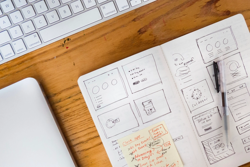
Mistake 2: Overly Complex Layouts
Complex layouts are easy to create and hard to defend. Beginners often assume more sections, more colors, and more blocks will make a page feel more professional. Usually the opposite happens. The page becomes busy, the message weakens, and the visitor spends extra energy deciding what matters first.
What complexity usually means
Overly complex layouts usually show up in one of four ways:
- Too many visual styles on one page.
- Multiple sections all competing to be the main point.
- Decorative elements that do not help hierarchy or readability.
- Blocks of text with no breathing room or visual breaks.
There is a difference between rich and crowded. A rich page has a clear order, a clear rhythm, and a small number of repeated design rules. A crowded page keeps introducing new rules every few inches and expects the visitor to adapt as if nothing strange is happening.
How to simplify without making the site dull
The safest way to simplify a layout is to decide what each section is responsible for. One section should explain the offer. Another should provide proof. Another should move the visitor toward the next action. If a section tries to do five jobs at once, it usually fails at all five.
Use the following sequence when you review a page:
- Remove one decorative element that does not help the message.
- Combine two text blocks that say nearly the same thing.
- Give the headline more space above and below.
- Keep one section visually stronger than the next.
- Repeat the same card, button, or heading pattern instead of inventing a new one for every section.
Structure does not kill style. It protects style from becoming noise. A good boutique website can still feel expressive, but the expression should be organized enough that visitors can follow it.
One useful comparison is the site’s Boutique Web Design page, which shows how a design direction can stay polished without losing the reader in decorative excess. That same logic applies here: the goal is not minimalism for its own sake, but clarity with enough personality to feel deliberate.
If you want a simple visual rule, use one dominant idea per screen. That might be a hero message, a service promise, a testimonial, or a contact call to action. When every screen is allowed one dominant idea, the site becomes easier to scan and the user experience feels calmer.
Why beginners overdesign
Beginners usually overdesign for one of three reasons. First, they are trying to show everything they can do. Second, they are afraid the page will look empty if they remove too much. Third, they are mixing up detail with quality. But quality is often the result of disciplined subtraction, not decoration piled on top of uncertain structure.
When I review a new page, I ask one blunt question: what would be missing if this section were cut in half? If the answer is “not much,” the page is carrying extra weight. The fix is not dramatic. It is usually a matter of reducing competing elements until the core message can breathe.
Mistake 3: Ignoring Mobile Users
Ignoring mobile users is not a small oversight. It is a sign that the design was judged in the wrong environment. A desktop layout can hide problems that become obvious the moment a page is viewed on a phone: cramped text, tiny buttons, long scroll stretches, awkward image crops, and menus that need three taps before they become useful.
Modern web design has to respect smaller screens because that is where many people encounter a site first or return to it later. The exact traffic mix changes over time, but the larger point is stable: if the mobile version is weak, the site is incomplete. Google’s responsive design guidance exists for a reason, and it is not because phones are a rare edge case.
For a live device mix snapshot, StatCounter’s global platform share dashboard is a quick reminder that mobile is not a side channel. The exact numbers move, but the direction is clear enough to make “desktop only” feel outdated.
What goes wrong on mobile
- Text is too small or too tightly spaced.
- Buttons are too close together or too small to tap comfortably.
- Images do not scale well and crop important details.
- Sections become too tall and force endless scrolling.
- Menus and forms are difficult to use with one hand.
These problems are not just inconvenient. They change how trustworthy the site feels. A visitor does not consciously think, “This interface has failed mobile usability principles.” They think, “This site is annoying,” and then they leave. The exit is usually quicker than the diagnosis.
How to design for mobile more safely
My practical advice is to design the mobile version early, not as the final polish stage. If you make the page work on a small screen first, you are less likely to bury the core message under decorative clutter. That approach forces the design to earn every element.
- Keep the headline short enough to break cleanly.
- Use large enough tap targets for buttons and menu items.
- Stack content in a logical order instead of forcing side-by-side layouts to survive.
- Check image crops before you approve them.
- Make the call to action visible without scrolling forever.
A useful mobile rule: if the page feels calm on a phone, it usually feels calm everywhere else. Mobile exposes the weak points quickly; that is why it is such a useful test.
For a practical reference, web.dev’s responsive design basics covers the core idea in plain language. I think of it as a reminder that responsive design is not a specialty feature. It is standard behavior.
If you want to see how this affects content planning as well as layout, the blog is the right place to look. A blog index is only useful when it stays readable on a small screen and when the list of posts does not become a puzzle of cropped cards and awkward buttons.
You can also compare the problem against real-world device data when you want to persuade a skeptical client or a team member. The point is not to win a statistics contest. The point is to show that mobile design decisions are ordinary business decisions, not optional refinements.
How to test without a lab
You do not need specialized equipment to catch most mobile issues. Start with these checks:
- Open the page on an actual phone if possible.
- Use a browser resize view and watch where the layout breaks.
- Tap every button and menu item with your thumb, not a mouse.
- Read the page in one pass without zooming.
- See whether the primary action is obvious within the first screen.
That is enough to reveal most of the problems beginners create. If the site passes those checks, it is usually much closer to ready than the version that looked “fine on my laptop.”
Mistake 4: Neglecting SEO
SEO is often treated like a separate marketing task, but design choices have a direct effect on it. A page with weak headings, unclear titles, missing alt text, or a confusing content order makes life harder for search engines and human readers at the same time. That is efficient in the worst possible way.
Beginners sometimes think SEO means stuffing keywords into the page like packing peanuts. It does not. Good SEO is mostly clarity. It helps the search engine understand the page and helps the reader find what they came for without friction. That is why the design and the content strategy should be working together from the beginning.
How design affects search visibility
Search engines read structure. They care about headings, internal links, image alt text, descriptive titles, and whether the page is organized in a way that makes sense. A page that looks stylish but lacks structure can still struggle to perform because the content is difficult to interpret.
Some of the simplest SEO mistakes are also the easiest to avoid:
- Using one heading style for every section.
- Writing titles that sound clever but say nothing useful.
- Leaving images without descriptive alt text.
- Hiding internal links instead of using them naturally.
- Publishing thin pages that never answer the visitor’s question fully.
Google Search Central’s SEO Starter Guide is a good starting point because it keeps the basics visible. I would summarize the practical lesson like this: give the page a clear topic, useful headings, and enough substance to deserve the click it receives.
Basic SEO habits for designers
- Use one H1 that clearly names the page topic.
- Break long pages into meaningful H2 and H3 sections.
- Write alt text that describes the image in context, not just the file name.
- Link to related pages when the link genuinely helps the reader.
- Make sure the page has enough text to explain the offer, not just a slogan and a hero image.
That list is not glamorous. It is, however, dependable. SEO works best when it is treated as a consequence of good page design rather than a separate magic trick.
If you are writing on this site, the relevant internal paths are straightforward. Use services when the reader needs help, use /blog/ when they want more examples, and use related pages only when they genuinely add context. Search optimization is easier when the site gives visitors a clear route instead of a pile of competing destinations.
SEO and usability usually want the same thing
This is the part beginners often miss. Good SEO is not a separate world from good UX. A page that is easy to scan is usually easier to index. A page that has descriptive labels is usually easier to understand. A page with a clear hierarchy is usually easier to summarize in search results. The overlap is large, which means many mistakes cost you twice.
There is a quiet advantage in that overlap. If you fix the page for people, you often improve it for search at the same time. That is one of the few places in web design where the work is mercifully not duplicated.
Conclusion and Best Practices
The real pattern behind beginner web design mistakes is simple: a site usually fails when it asks visitors to do more work than necessary. Poor navigation makes the path hard to find. Overly complex layouts make the page hard to read. Ignoring mobile users makes the design fragile. Neglecting SEO makes the page harder to discover and harder to understand.
When I reduce all of this to one working principle, it is this: clarity is the safest default. Clear navigation beats clever labels. Clear hierarchy beats decorative clutter. Clear mobile behavior beats desktop-only confidence. Clear structure beats keyword stuffing. The site can still have personality, but personality should serve the page, not replace it.
Here is the practical version of the same advice:
- Use plain page names and a short, predictable menu.
- Give each section one job.
- Test the site on a phone before you approve the design.
- Make headings, links, and alt text useful to both people and search engines.
- Let the layout guide attention instead of competing for it.
If you want to keep going, the most useful next stop is the blog for more design and content planning articles, or the services page if you want a more direct path to help with layout, branding, or website cleanup. Those two paths should answer most of the next questions a beginner has.
The decision rule is simple: if a design choice makes the visitor pause, guess, squint, or backtrack, it probably needs another pass. The better choice is usually the one that removes friction without removing character. Web design is not a contest to see how much confusion can be made to look fashionable.
Key takeaways:
- Navigation should be obvious, short, and labeled in plain language.
- Complex layouts become clearer when every section has one job.
- Mobile design is not optional, because the small screen exposes weak structure fast.
- SEO improves when the page is structured for humans first and search engines second.
- The safest beginner strategy is to make the page easier to scan, easier to trust, and easier to act on.