Responsive design is the difference between a website that serves the whole audience and one that quietly gives up on smaller screens. The idea is straightforward: a page should adapt its layout, navigation, images, and content hierarchy to the device in front of it. A desktop visitor and a phone visitor should not have to wrestle with the same arrangement of elements, because one of them will lose and it is usually the smallest screen.
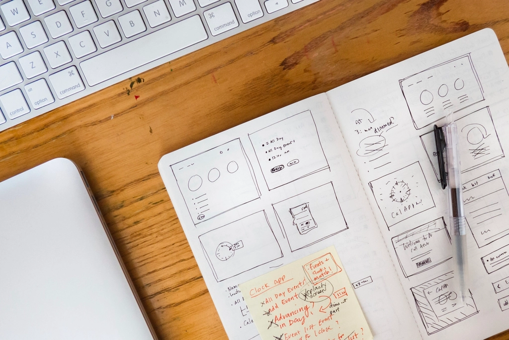
What Responsive Design Means
Responsive design uses fluid layouts, flexible media, and CSS breakpoints so the same content can reflow across phones, tablets, laptops, and larger displays. MDN’s guide to using media queries is a clear reference point for the technical part of that change.
The shift mattered because the web stopped being a desktop-only environment a long time ago. Mobile traffic is now normal traffic, not a side case. Google’s mobile-first indexing guidance is a good reminder that search engines evaluate that reality too.
Benefits of Responsive Design
- Better user experience: People can read, tap, and navigate without zooming like they are examining evidence in a detective novel.
- Stronger mobile performance: A mobile-friendly layout usually keeps more visitors engaged long enough to act.
- Improved SEO: Search engines prefer pages that work well across devices and present the same important content consistently.
- Lower maintenance cost: One well-structured site is easier to manage than separate desktop and mobile versions.
For business owners, the operational benefit is simple: fewer layout exceptions, fewer support complaints, and fewer moments where a customer leaves because the form looked broken on their phone.
How to Implement Responsive Design
- Start with content priorities. Decide what has to be visible first on a small screen. If everything is important, nothing is.
- Use flexible grids and spacing. Build with percentages, flexible containers, and relative units so the layout can expand and contract cleanly.
- Apply media queries with intent. Set breakpoints where the design actually needs to change, not just where a framework told you to stop.
- Make images and media responsive. Keep media from overflowing containers and use sizes that match the available space.
- Test on real devices and browser tools. Check touch targets, navigation, forms, and image scaling on more than one screen size.
CSS breakpoints are practical, but they work best when they follow the content instead of forcing content to obey the grid. Bootstrap’s breakpoint documentation is useful if you want a known system to build from, while web.dev’s responsive design basics offers a solid explanation of the underlying approach.
Tools for Responsive Web Design
The tool choice depends on what stage you are in. Design teams often need to sketch layout behavior before development begins. A web app generator can be useful for getting a working prototype on screen quickly, then refining the responsive behavior once the content structure is proven.
| Tool | Best use | Why it helps |
|---|---|---|
| Figma | Layout planning | Helps teams map mobile and desktop views before code is written. |
| Adobe XD | Prototyping | Useful for wireframes and early interactive flow checks. |
| BrowserStack | Testing | Lets you verify behavior across real devices and browser combinations. |
| Responsinator | Quick layout checks | Gives a fast view of how a page renders at common screen sizes. |
Conclusion and Resources
Responsive design is not a decorative detail. It is a basic operating requirement for modern websites. When the layout adapts well, visitors can find what they need faster, search engines can understand the content more cleanly, and the business spends less time cleaning up avoidable problems.
If your site still feels like it was designed for one screen and tolerated by the rest, start with the priority list: content, layout, media, and testing. Then review the structure with a clear business lens. The About page explains the team behind the work, and the Services page is the right place to look if you need a responsive redesign or a cleaner website foundation.