User experience is the part of web design that decides whether a visitor feels guided or mildly betrayed by the menu. It is the boring magic that keeps a site usable, trustworthy, and worth revisiting.
When people talk about UX, they are not talking about one flashy trick. They are talking about the full trip: how easy the site is to understand, how quickly it responds, whether it works on a phone, whether it feels accessible, and whether the next step is obvious. If UI is the outfit, UX is whether the outfit lets you move your arms.
What User Experience Means
UX stands for user experience. In plain English, it is the sum of everything a person feels and does while using a website. That includes the obvious stuff, like button labels and page speed, but also the less glamorous stuff, like whether a form feels reassuring and whether the site makes sense without a scavenger hunt.
According to Nielsen Norman Group’s definition of user experience, UX includes all aspects of the end user’s interaction with a company, its services, and its products. That is a broad net, which is exactly the point. A website is not just a page. It is a sequence of decisions.
| UX | UI |
|---|---|
| How the site works, feels, and guides people. | How the site looks and how the interface is arranged. |
| Navigation, accessibility, speed, clarity, trust, and feedback. | Buttons, colors, spacing, typography, icons, and visual polish. |
| The whole journey from landing to task completion. | The visible interface visitors interact with on each screen. |
UX and UI overlap constantly, which is why they get mixed up so often. But the simplest way to separate them is this: UI is the surface, UX is the experience of using the surface without wanting to throw your laptop into the sea.
Why UX Matters in Web Design
Good UX is not a decorative extra. It affects whether people stay, whether they trust what they see, and whether they complete the action you wanted in the first place. A polished page with confusing navigation still feels broken. A simple page with clear structure often feels more professional than a busy one with seven different ways to get lost.
1. It improves user satisfaction
Visitors do not usually praise a website for being easy. They notice when it is hard. That means good UX often works invisibly: people finish the task, move on, and never have to think about the interface again. Which, in design terms, is a compliment.
2. It can improve conversions
Every small point of friction can push someone away from a contact form, product page, or signup flow. If a button is unclear, if the form is too long, or if the page feels chaotic, the user is doing extra mental labor. That labor is expensive. Clear UX lowers that cost.
3. It shapes brand perception
People often judge a brand by how the website behaves. A site that feels calm, predictable, and respectful makes the brand feel thoughtful. A site that hides information or behaves inconsistently makes the brand feel like it was assembled during a lunch break.
Accessibility is part of that trust. The W3C accessibility introduction is a good reminder that inclusive design is not a niche preference. It helps more people use the site successfully, which is the whole assignment.
Responsive layout matters too. Google’s responsive web design basics explains why a site has to adapt cleanly across devices. A page that looks elegant on a desktop but collapses into chaos on a phone is not fully designed. It is only half dressed.
Key Principles of Good UX Design
Good UX usually comes from a few disciplined habits repeated well. Not from a miracle. Not from adding another gradient. Definitely not from making every button shout louder than the others.
User-Centered Design
Design for the person who needs the site, not for the internal org chart. A user-centered page starts with real questions: What is the visitor trying to do? What do they need first? What can be removed without hurting the task? That approach keeps the page from becoming a museum of unrelated ideas.
A practical check is to ask whether the homepage, a service page, and the contact page all answer the visitor’s next question. If they do not, the site is making users work too hard.
Consistency and Predictability
People like to know what will happen when they click something. Repeating the same button style, heading rhythm, and navigation structure helps users build confidence quickly. Consistency is not boring. It is the quiet part that makes the rest of the design usable.
- Keep labels consistent across pages.
- Use the same visual pattern for similar actions.
- Do not rename common pages just to sound clever.
- Make links and buttons behave the same way every time.
Feedback and Response Time
A site should always tell the user what happened. If a form was submitted, say so. If something is loading, show that it is loading. If an error happened, explain it in human language. Silence is fine for a library. It is less helpful for a web form.
The same idea applies to performance. Faster pages feel more reliable because they reduce uncertainty. Even when the content is good, a laggy interface can make the whole site feel tired.
Accessibility and Readability
Readable typography, sufficient contrast, keyboard-friendly navigation, and useful alt text are all part of UX, not separate chores. If a visitor cannot perceive or reach the content, the design is not complete. That is not a dramatic statement. It is just the math of inclusion.
If you want a plain-language refresher on why readability matters, the site’s own Typography on User Engagement article pairs nicely with this topic. Great UX and good typography are cousins who borrow each other’s best habits.
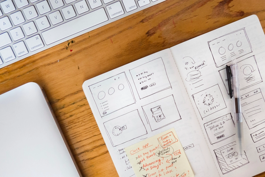
Tools for Testing User Experience
UX is easiest to improve when you stop guessing and start observing. The goal is not to collect fancy dashboards for the office wall. The goal is to see where people hesitate, misclick, ignore, or abandon the task.
| Tool or method | What it tells you | Best use |
|---|---|---|
| Usability testing | Where people get stuck while trying to complete a task. | Watching real users try the site with no coaching. |
| Heatmaps | Where visitors click, scroll, and hesitate. | Spotting ignored sections or confusing page areas with visual click and scroll maps. |
| A/B testing | Which version performs better in practice. | Comparing headlines, calls to action, or page layouts with a controlled test. |
| Performance testing | Whether the page loads and responds quickly enough. | Checking load times and friction with Google PageSpeed Insights. |
| Accessibility checks | Whether the interface is usable for more people. | Reviewing labels, contrast, keyboard navigation, and structure with plain-language usability guidance. |
For a broader testing workflow, a small round of usability testing beats a large pile of assumptions. Ask one person to find the services page, one person to finish a form, and one person to explain what the page is for. If they cannot do that without help, the interface is sending mixed signals. The Usability.gov usability testing guide is a solid plain-English companion when you want a structure for those sessions without turning them into a government-themed obstacle course.
Heatmaps and analytics are useful because they reveal behavior, but they should not be treated like mind-reading machines. They show what happened, not always why it happened. That is why the strongest UX work usually combines observation, testing, and a little healthy suspicion toward your first draft.
Conclusion and Resources
User experience is the part of web design that turns visuals into something usable. It affects satisfaction, conversion, and brand trust. It also makes the difference between a site that feels polished and a site that feels like it was assembled while the coffee was still brewing.
If you want to keep improving UX, start with three habits: design for real people, keep the interface consistent, and test your assumptions early. Small improvements in clarity, speed, and accessibility usually add up faster than one giant redesign.
For more about this site’s approach, see the About page. If you want help shaping a clearer, more user-friendly site, the Services page is the right next stop. If you want to go deeper, the linked guidance above from Nielsen Norman Group, W3C, web.dev, and Usability.gov is the sensible next stack of tabs.
Try this once: open one of your site’s most important pages on your phone and watch your thumb, not your intention. If the page does not guide your thumb naturally, UX still has work to do.